
We started with introductions and shared our natural creative talents.
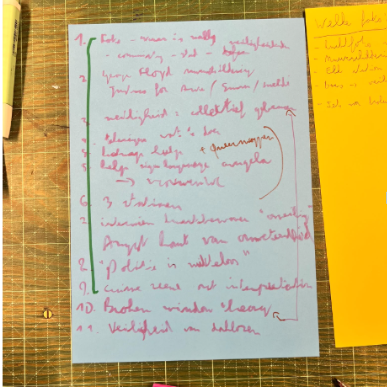
Based on those, we were split into three teams of three. My team came from very different walks of life, from an urban hiking lover to a queer activist to a government worker, but one thing connected us: safety. We chose it as the central theme of our magazine because each of us experiences the city differently, and so each of us sees safety from a different point of view.
We started with introductions and shared our natural creative talents. Based on those, we were split into three teams of three. My team came from very different walks of life, from an urban hiking lover to a queer activist to a government worker, but one thing connected us: safety. We chose it as the central theme of our magazine because each of us experiences the city differently, and so each of us sees safety from a different point of view.
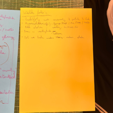
That is where the first stage began: the brainstorm. The task went well beyond writing. We would create our own editorial through film photography and then bind the finished magazine ourselves. No screens, only brainpower and paper. We were only allowed to use pictures we took ourselves with analogue cameras, or find a creative way to turn existing materials into something new, like scanning pieces of books or using special paper to make a collage.
In the second and third working moments, we went deeper into our pictures and ideas, worked out what each page would look like and started thinking about the binding. For us, safety meant many things. It was the use of symbolic figures, like Mother Maria in Colombia, to combat unsafety. It was what safety looks like when you walk around Brussels. And it was a harder question too: do we feel safe when we see cops or military people walking around with guns? Questions like these meant we had to edit a lot of our ideas. One thing Otto told us stuck with me: it is not about filling pages with content, it is about the message, and not everything needs text. Sometimes a picture tells a better story than words.
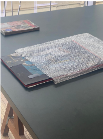
The binding is where you pick your colours and decide which textures you want to bring out, and it shapes how people receive your project. We chose the colours of the Belgian flag, which you only see the deeper you go into the magazine. Safety was our red thread, so we put the whole magazine inside bubblewrap, the best way we could think of to protect a magazine about safety. Page by page we glued in pictures, some printed bigger and others cut out to make collages. It became a deep dive into how different communities within the same city define safety for themselves, and into what true safety is if not the work of all of us: “SAFE”.
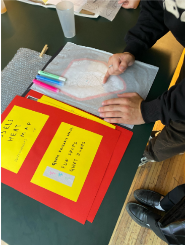
The workshop ended with an expo, where we could invite family and friends and see what the other two teams had created. It was nice to create for the sake of creating, with no reward other than participating, sharing and learning from each other. I was impressed by how creativity can take you on different journeys even with the same starting point.
One team bound their magazine in postcard style, with an equal amount of photo and text parts. As the reader, you could match any photo with any text you wanted, which let you experience the magazine “SEEN” the way you see things.
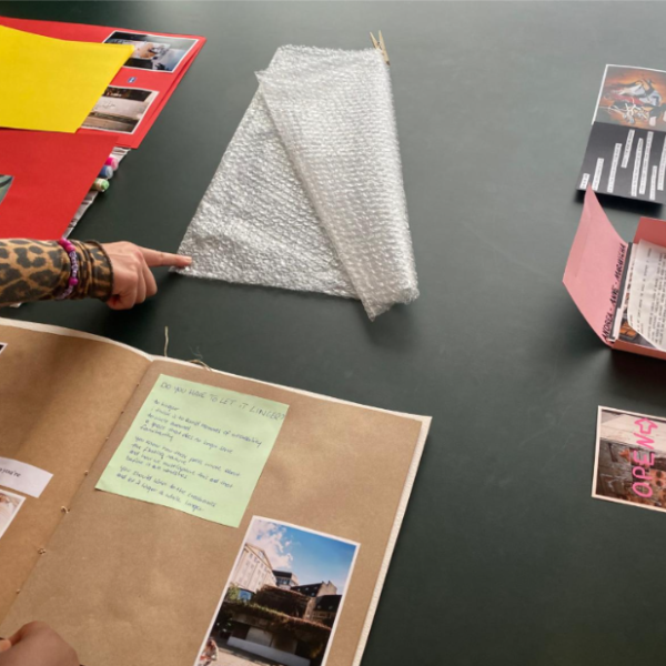
The other team used beautiful textures and thread to bind their project, “COMMON”. They asked the people who live in the city what certain spaces could be and what they wished to see added, and the answers came together through games, testimonies and drawings.
We each explained our process to the visitors, and mentioning that no computers were used mattered. Everything around us is usually made on a screen, and here were three magazines made with hands, paper and glue. I came in expecting screens and keyboards, and I left with a bubblewrapped magazine called “SAFE” and a new idea of what making one can be.
PS: For a beautiful visual representation of the 3 magazines, I invite you to check the post that Otto made, where they were beautifully displayed